


Listen to This Article
1. Fresh & Vibrant✨

This palette brings together a refreshing mix of soft and bold shades, perfect for nature-inspired designs, eco-friendly brands, or wellness projects.
Color Codes:
#f9fefa - Soft White
#037764 - Deep Teal
#fed703 - Bright Yellow
Best for: Organic brands, wellness businesses, sustainable design.
2. Cool & Sophisticated ❄️

A calming and professional palette, ideal for corporate branding, tech startups, or minimalist designs. The deep, cool tones provide a sense of stability and trustworthiness.
Color Codes:
#f9fefa - Soft White
#41695e - Muted Teal
#033b4a - Dark Blue-Green
Best for: Finance, tech, and professional business branding.
3. Bold & Elegant ✨

Perfect for luxury branding, fashion, or high-end designs, this warm yet striking palette adds a touch of sophistication and exclusivity.
Color Codes:
#ffffff - Pure White
#9e7408 - Rich Gold
#fcee4b - Vibrant Yellow
Best for: Luxury brands, fashion, beauty industry.
4. Futuristic & High-Tech

A modern and futuristic combination, this palette is great for tech brands, gaming visuals, or cyber-themed designs.
Color Codes:
#fefefc - Off White
#08144f - Deep Navy
#42c4ff - Neon Blue
Best for: Tech startups, gaming, futuristic branding.
How to Use These Palettes Effectively
✅ Test Contrast: Ensure text remains readable when using these colors.
✅ Pair with Neutrals: If needed, add subtle greys or blacks for balance.
✅ Experiment & Adapt: Play around with variations to match your project’s needs.
Final Thoughts
Color is a powerful tool in design. By choosing the right color palette, you can instantly convey emotion, improve aesthetics, and create a memorable experience for your audience. Whether you're aiming for sophistication, energy, or a futuristic vibe, these palettes will help bring your vision to life!
 Unlock Your Savings Today!
Get the best deals with unbeatable service and exclusive offers.
You May Also Like - More to Explore
8 Min Read Time
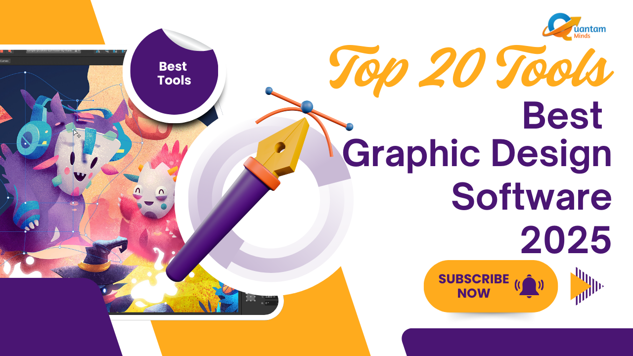
1.9k ViewsBest Graphic Design Software 2025 – Top 20 Tools for Designers & Creators
Explore the top 20 graphic design tools of 2025 for branding, marketing, UX/UI, and AI-powered creativity. Find the best fit ... Explore More
 Pallavi Singh
2025-05-23
Pallavi Singh
2025-05-23
3 Min Read Time
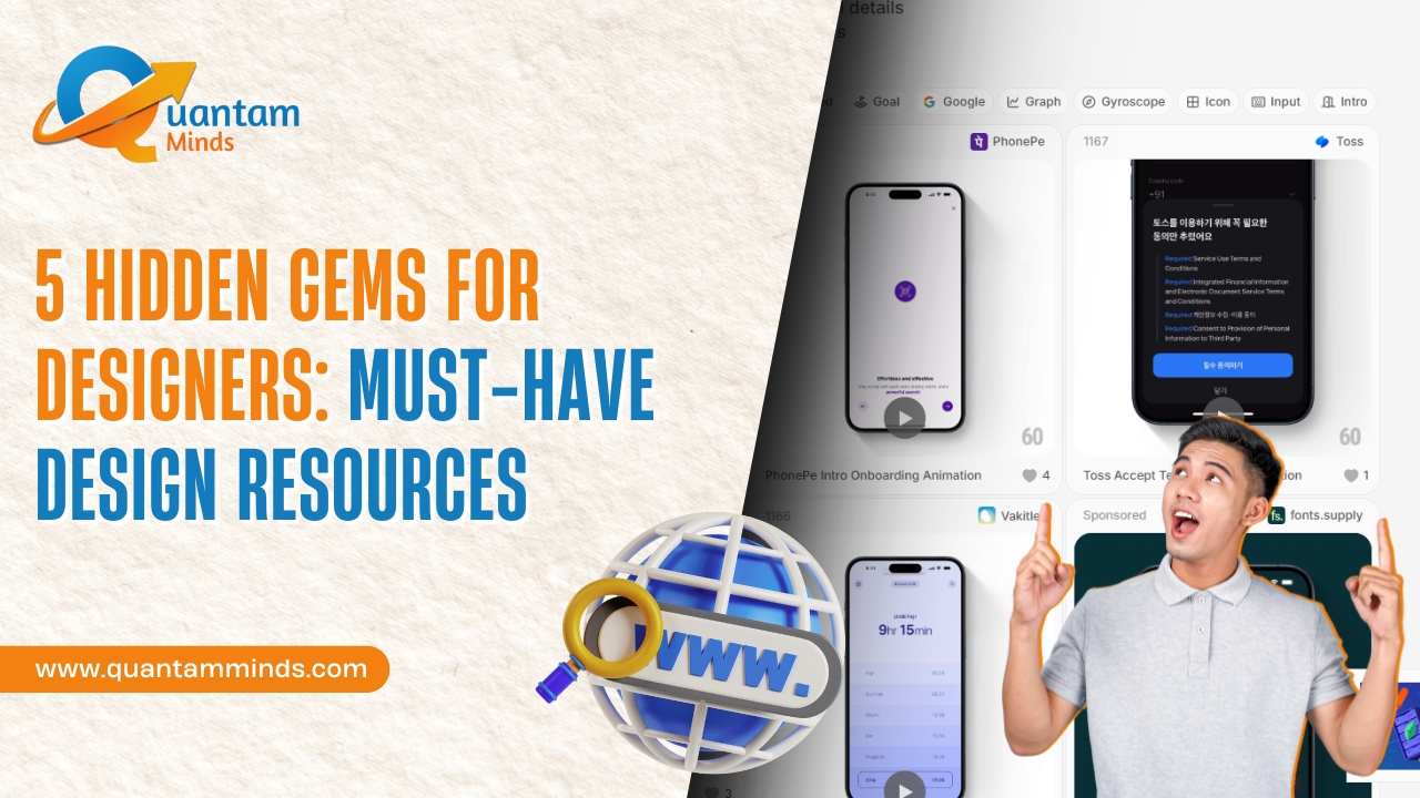
1.9k Views5 Hidden Gems for Designers: Must-Have Design Resources
Discover 5 underrated design resources to enhance your creativity and productivity. Perfect for designers seeking inspiration... Explore More
 Ravinder Kumar
2025-03-22
Ravinder Kumar
2025-03-22
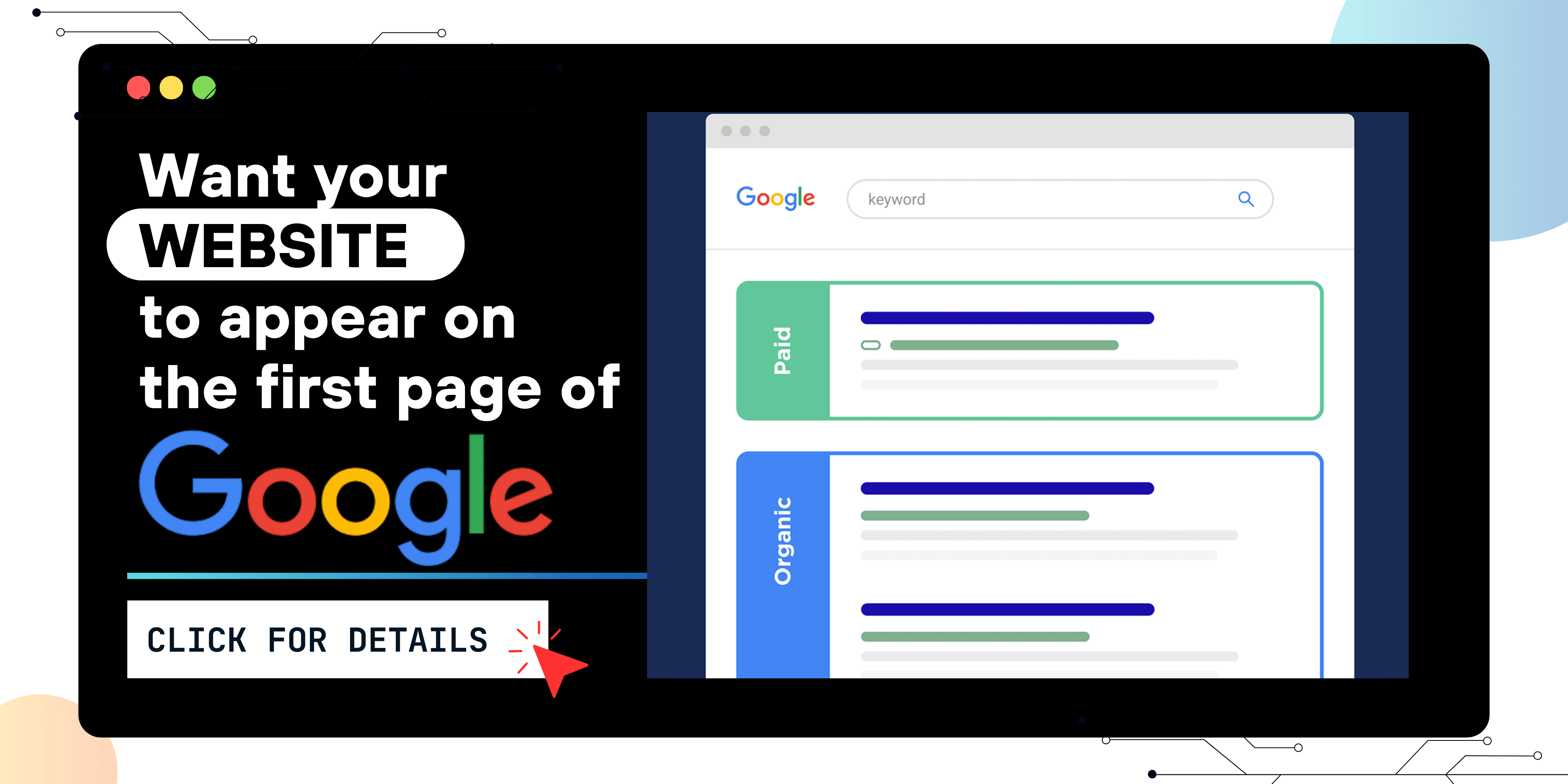
 Grow Your Business with Proven Digital Marketing
Ready to attract more customers and outshine your competition? Our tailored digital marketing strategies help you rank higher, generate qualified leads, and build a brand people trust. Let’s take your business to the next level.
Digital Marketing Solutions in Leading Cities
Best Digital Marketing Company in Sonipat | Quantam Minds
Boost your local business with Quantam Minds, the leading digital marketing company in Sonipat. We specialize in SEO, social media, and Google Ads to help you reach more customers, generate leads, and grow your brand online. Trusted by businesses in Kundli, Rai, Murthal, and across Sonipat. Explore This Service
Digital Marketing Company in Ambala - SEO, Google Ads, social media marketing
Looking for the best digital marketing company in Ambala? Quantam Minds offers SEO, Google Ads, social media marketing, and lead generation for local businesses. Explore This Service
Digital Marketing Company in Laxmi Nagar | Quantam Minds
digital marketing Company in Laxmi Nagar by Quantam Minds. Boost your business with SEO, social media, ads & more. Get results-driven strategies! Explore This Service
Digital Marketing Service in Connaught Place – Quantam Minds
Boost your business with expert digital marketing services in Connaught Place. SEO, social media & Google Ads by Quantam Minds. Affordable & results-driven. Explore This Service
Digital Marketing Agency in Saket – Quantam Minds
Get affordable, result-driven digital marketing Agency in Saket. Quantam Minds offers SEO, social media, and Google Ads to boost your business growth. Explore This Service
Digital Marketing Services in Rohini
Enhance your business visibility and growth with expert digital marketing services in Rohini. Specializing in SEO, social media marketing, and Google Ads. Explore This Service
Digital Marketing Service in Karol Bagh – Quantam Minds
Get affordable and result-oriented digital marketing service in Karol Bagh. Boost your business with SEO, Social Media, and Google Ads solutions. Explore This Service
Digital Marketing Service in Pitampura – Boost Your Local Business
Drive business growth with expert digital marketing service in Pitampura. We offer SEO, social media, and paid ads tailored for local success. Explore This Service
Digital Marketing Service in Janakpuri – Top Digital Marketing Agency
Get professional and affordable digital marketing service in Janakpuri. Boost your business with SEO, social media marketing, and Google Ads for fast growth. Explore This Service
Digital Marketing Service in Preet Vihar – Quantam Minds
Boost your online presence with result-driven digital marketing in Preet Vihar. From SEO to Google Ads, get complete digital solutions for business growth. Explore This Service
Digital Marketing Service in Nehru Place – Quantam Minds
Drive business growth with expert digital marketing in Nehru Place. Quantam Minds offers SEO, PPC, Social Media, and complete online marketing solutions. Explore This Service
Digital Marketing Service in Mumbai – Quantam Minds
Boost your online visibility with top-rated digital marketing in Mumbai. Get complete solutions like SEO, Google Ads & Social Media by Quantam Minds. Explore This Service
Digital Marketing Service in Lucknow – Quantam Minds
Boost your business online with expert digital marketing in Lucknow. SEO, PPC, social media & content solutions tailored for local growth by Quantam Minds. Explore This Service
Digital Marketing Service in Chennai – Quantam Minds
Drive growth with expert digital marketing in Chennai. From SEO to social media, get customized digital marketing services by Quantam Minds for your business success. Explore This Service
Digital Marketing Service in Bangalore – Quantam Minds
Boost your online presence with expert digital marketing in Bangalore. SEO, Google Ads, social media—get complete growth solutions for your business. Explore This Service
Digital Marketing Service in Kolkata – Quantam Minds
Boost your business with expert digital marketing in Kolkata. From SEO to social media, Quantam Minds helps you grow online in key areas like Salt Lake, Park Street & Rajarhat. Explore This Service
Digital Marketing Service in Ahmedabad – Quantam Minds
Scale your business online with expert digital marketing in Ahmedabad. Quantam Minds specializes in SEO, PPC, and social media marketing in GIFT City, SG Highway, and Prahladnagar. Explore This Service
Digital Marketing Service in Jaipur – Quantam Minds
Boost your online presence with expert digital marketing in Jaipur. Quantam Minds offers SEO, social media, and PPC services in key areas like Vaishali Nagar, MI Road, and Jagatpura. Explore This Service
Digital Marketing Services in Indore – Quantam Minds
Get top-rated digital marketing services in Indore. Quantam Minds helps you grow online through SEO, social media, and PPC across Vijay Nagar, AB Road, and Palasia. Explore This Service
Digital Marketing Services in Kochi – Quantam Minds
Grow your business with the best digital marketing agency in Kochi. Quantam Minds offers SEO, social media marketing, PPC, and more for startups & enterprises. Explore This Service
Digital Marketing Services in Ludhiana – Quantam Minds
Boost your business with the best digital marketing agency in Ludhiana. Quantam Minds offers SEO, social media marketing, PPC, and more for local and global success. Explore This Service
Digital Marketing Services in Bhopal – Quantam Minds
Grow your Bhopal business with Quantam Minds, a top-rated digital marketing company in Bhopal. Get expert SEO, social media, PPC & more. Explore This Service
Digital Marketing Company in Jabalpur – Quantam Minds
Grow your Jabalpur-based business with the best digital marketing agency in Jabalpur. Quantam Minds offers SEO, PPC, social media, and more for startups & enterprises. Explore This Service
Digital Marketing Company in Gwalior – Quantam Minds
Boost your brand with the best digital marketing company in Gwalior. Quantam Minds offers SEO, PPC, and social media marketing for startups and enterprises. Explore This Service
digital marketing company in Ujjain – Quantam Minds
row your business with the best digital marketing agency in Ujjain. Quantam Minds offers SEO, PPC, social media marketing & local SEO services. Explore This Service
Digital Marketing Agency in Gurgaon – SEO, PPC & Social Media Experts
Grow your business online with Quantam Minds – the leading digital marketing agency in Gurgaon offering SEO, PPC, and social media solutions tailored for local success. 🌐✨ Explore This Service
Digital Marketing Company in Faridabad – Quantam Minds
"Looking for the digital marketing company in Faridabad? Quantam Minds offers SEO, PPC, and social media marketing for local business growth. Explore This Service
Digital Marketing Agency in Panipat – Quantam Minds
Looking for a result-driven digital marketing company in Panipat? Quantam Minds offers expert SEO, PPC, local SEO, and full-funnel services to grow your business Explore This Service
Digital Marketing Company in Karnal – Quantam Minds
Partner with Quantam Minds – the top digital marketing company in Karnal. Boost visibility, generate leads, and grow your business with expert SEO and PPC. Explore This Service
Best Digital Marketing Company in Rohtak – SEO, Google Ads, social media marketing
Looking for a digital marketing company in Rohtak? Quantam Minds offers SEO, Google Ads, local marketing, and social media strategies to grow your business Explore This Service
Digital Marketing Company in Hisar – Quantam Minds
Partner with the best digital marketing agency in Hisar. Quantam Minds offers SEO, PPC, lead generation, and branding for local Hisar businesses Explore This Service
Digital Marketing Company in Panchkula – Quantam Minds
Partner with the best digital marketing agency in Panchkula. Quantam Minds offers SEO, PPC, social media marketing, and lead generation for businesses in Panchkula. Explore This Service
Digital Marketing Company in Yamunanagar – Quantam Minds
Grow your business with the best digital marketing Company in Yamunanagar. Quantam Minds offers SEO, social media, PPC, and lead gen services for local success. Explore This Service
Digital Marketing Company in Rewari – Quantam Minds
Partner with the best digital marketing agency in Rewari. Quantam Minds offers SEO, PPC, and lead generation services tailored for Rewari businesses. Explore This Service
Digital Marketing Company in Sirsa – Quantam Minds
Grow your brand with the best digital marketing agency in Sirsa. Quantam Minds offers SEO, PPC, social media, and digital growth services in Sirsa. Explore This Service
Digital Marketing Company in Jind – Quantam Minds
Get expert digital marketing services in Jind by Quantam Minds. Best digital marketing agency in Jind for SEO, PPC, lead generation & online branding Explore This Service
Digital Marketing Agency in kanpur – Quantam Minds
Grow your business online with the best digital marketing agency in Kanpur. Quantam Minds offers SEO, paid ads, and full digital strategies that work. Explore This Service
Digital Marketing Company in Agra – Quantam Minds
Partner with the best digital marketing agency in Agra. Quantam Minds offers SEO, Google Ads, lead generation, and online branding services for Agra businesses Explore This Service
Digital Marketing Company in Ghaziabad – Quantam Minds
Grow your business online with the best digital marketing agency in Ghaziabad. Quantam Minds offers SEO, PPC, social media & full digital solutions Explore This Service
Digital Marketing Agency in Meerut – Quantam Minds
Work with the best digital marketing agency in Meerut. Quantam Minds offers local SEO, social media, PPC & lead generation services tailored for Meerut businesses. Explore This Service
Digital Marketing Agency in Varanasi – Quantam Minds
Grow your business with the best digital marketing agency in Varanasi. Quantam Minds offers SEO, paid ads, local SEO & content marketing solutions. Explore This Service
Best Digital Marketing Agency in Allahabad | Quantam Minds
Looking for the best digital marketing agency in Allahabad ? Quantam Minds offers SEO, Google Ads, and online branding for businesses across Allahabad. Explore This Service
Digital Marketing Agency in Aligarh – Quantam Minds
Grow your business with the best digital marketing agency in Aligarh. Quantam Minds offers SEO, social media, Google Ads & website development for Aligarh businesses Explore This Service
Digital Marketing Agency in Bareilly – Quantam Minds
Looking for the digital marketing agency in Bareilly? Quantam Minds offers SEO, Google Ads, social media marketing, and lead generation for local businesses. Explore This Service
Digital Marketing Agency in Ayodhya – Quantam Minds
Looking for the best digital marketing agency in Ayodhya? Quantam Minds offers SEO, Google Ads, social media marketing, and website solutions for local growth Explore This Service
Digital Marketing Agency in Moradabad – Quantam Minds
Looking for the digital marketing agency in Moradabad? Quantam Minds offers SEO, Google Ads, social media marketing, and lead generation for local businesses. Explore This Service
Best Digital Marketing Agency in Saharanpur – Quantam Minds
Grow your business online with result-driven digital marketing in Saharanpur. Quantam Minds helps local brands boost visibility, leads, and sales through SEO, Google Ads, and social media strategies. 📈 Explore This Service
Digital Marketing Agency in Gorakhpur to Grow Your Local Business
Reach more customers in Gorakhpur with expert SEO, social media, and ads. Boost visibility and sales with digital marketing tailored for local growth. Explore This Service
Digital Marketing Agency in Jhansi – Quantam Minds
Looking for the best digital marketing agency in Jhansi? Quantam Minds offers SEO, Google Ads, social media marketing, and lead generation for local businesses. Explore This Service
Digital Marketing Company in Surat – Quantam Minds
Looking for the digital marketing agency in Surat? Quantam Minds offers SEO, Google Ads, social media marketing, and lead generation for local businesses. Explore This Service
Digital Marketing Agency in Chandigarh – Quantam Minds
Looking for the best digital marketing agency in Chandigarh? Quantam Minds offers SEO, Google Ads, social media marketing, and lead generation for local businesses. Explore This Service
Best Digital Marketing Company in Noida – Quantam Minds
Grow your Noida business online with the best digital marketing company. Get more leads and sales with SEO, PPC, and social media marketing. Explore This Service
Best Digital Marketing Company in Greater Noida – Quantam Minds
Grow your Greater Noida business online with the best digital marketing company. Get more leads and sales with SEO, PPC, and social media marketing. Explore This Service
Best Digital Marketing Company in Pune – Quantam Minds
Partner with the top digital marketing agency in Pune for SEO, social media, and Google Ads that drive growth. Explore This Service
Best Digital Marketing Company in Nagpur – Quantam Minds
Partner with the top digital marketing agency in Nagpur for SEO, social media, and Google Ads that drive growth. Explore This Service
Best Digital Marketing Company in Raipur – Quantam Minds
Grow your Raipur business online with the best digital marketing company. Get more leads and sales with SEO, PPC, and social media marketing. Explore This Service
Best Digital Marketing Company in Ranchi – Quantam Minds
Partner with the top digital marketing agency in Ranchi for SEO, social media, and Google Ads that drive growth. Explore This Service
Best Digital Marketing Company in Patna – Quantam Minds
Looking for the best digital marketing agency in Patna? Quantam Minds offers SEO, Google Ads, social media marketing, and lead generation for local businesses. Explore This Service
Digital Marketing Company in Bhubaneswar – Quantam Minds
Looking for the best digital marketing agency in Bhubaneswar? Quantam Minds offers SEO, Google Ads, social media marketing, and lead generation for local businesses. Explore This Service
Digital Marketing Company in Guwahati – Quantam Minds
Looking for the best digital marketing agency in Guwahati? Quantam Minds offers SEO, Google Ads, social media marketing, and website development for local businesses. Explore This Service
Digital Marketing Company in Dehradun – Quantam Minds
Looking for the best digital marketing agency in Dehradun? Quantam Minds offers SEO, Google Ads, social media marketing, and lead generation for local businesses. Explore This Service
Digital Marketing Company in Haridwar – Quantam Minds
Looking for the best digital marketing agency in Haridwar? Quantam Minds offers SEO, Google Ads, social media marketing, and lead generation for local businesses. Explore This Service
Digital Marketing Company in Rishikesh – Quantam Minds
Looking for the best digital marketing agency in Rishikesh? Quantam Minds offers SEO, Google Ads, social media marketing, and lead generation for local businesses. Explore This Service
Digital Marketing Company in Amritsar – Quantam Minds
Looking for the digital marketing company in Amritsar? Quantam Minds offers SEO, Google Ads, social media marketing, and lead generation for local businesses. Explore This Service
Digital Marketing Company in Jalandhar – Quantam Minds
Looking for the best digital marketing Company in Jalandhar? Quantam Minds offers SEO, Google Ads, social media marketing, and lead generation for local businesses. Explore This Service
Digital Marketing Company in Jammu – Quantam Minds
Looking for the best digital marketing agency in Jammu? Quantam Minds offers SEO, Google Ads, social media marketing, and lead generation for local businesses Explore This Service
Digital Marketing Company in Srinagar – Quantam Minds
Looking for the best digital marketing agency in Srinagar? Quantam Minds offers SEO, Google Ads, social media marketing, and lead generation for local businesses. Explore This Service
Digital Marketing Company in Vadodara – Quantam Minds
Looking for the best digital marketing agency in Vadodara? Quantam Minds offers SEO, Google Ads, social media marketing, and lead generation for local businesses. Explore This Service
Digital Marketing Company in Rajkot – Quantam Minds
Looking for the best digital marketing company in Rajkot? Quantam Minds offers SEO, Google Ads, social media marketing, and lead generation for local businesses. Explore This Service
Digital Marketing Agency in Bhavnagar – Quantam Minds
Looking for the best digital marketing agency in Bhavnagar? Quantam Minds offers SEO, Google Ads, social media marketing, and lead generation for local businesses. Explore This Service
Digital Marketing Agency in Gandhinagar – Quantam Minds
Looking for the best digital marketing agency in Gandhinagar? Quantam Minds offers SEO, Google Ads, social media marketing, and lead generation for local businesses. Explore This Service
Digital Marketing Agency in Anand – SEO, PPC & Social Media Experts
Looking for the best digital marketing agency in Anand? Quantam Minds offers SEO, Google Ads, social media marketing, and lead generation for local businesses. Explore This Service
Best Digital Marketing Company in Jamnagar – Quantam Minds
Looking for the best digital marketing agency in Jamnagar? Quantam Minds offers SEO, Google Ads, social media marketing, and lead generation for local businesses. Explore This Service
Best Digital Marketing in Mehsana – Quantam Minds
Looking for the best digital marketing agency in Mehsana? Quantam Minds offers SEO, Google Ads, social media marketing, and lead generation for local businesses. Explore This Service
Digital Marketing Company in Vapi – Quantam Minds
Looking for the best digital marketing agency in Vapi? Quantam Minds offers SEO, Google Ads, social media marketing, and lead generation for local businesses. Explore This Service
Best Digital Marketing Company in Kurukshetra – SEO, Google Ads, social media marketing
Looking for the best digital marketing agency in Kurukshetra? Quantam Minds offers SEO, Google Ads, social media marketing, and lead generation for local businesses. Explore This Service
Best Digital Marketing Company in Kaithal – Quantam Minds
Looking for the best digital marketing agency in Kaithal? Quantam Minds offers SEO, social media, Google Ads, and lead generation for local businesses. Explore This Service
Best Digital Marketing Agency in Fatehabad – Quantam Minds
Looking for the best digital marketing agency in Fatehabad? Quantam Minds offers SEO, Google Ads, social media marketing, and lead generation for local businesses. Explore This Service
Best Digital Marketing Company in Jhajjar – SEO, Google Ads, social media marketing
Looking for the best digital marketing agency in Jhajjar? Quantam Minds offers SEO, Google Ads, social media marketing, and lead generation for local businesses. Explore This Service
Digital Marketing in Bahadurgarh – SEO, Google Ads, social media marketing
Looking for the best digital marketing in Bahadurgarh? Quantam Minds offers SEO, Google Ads, social media marketing, and lead generation for local businesses. Explore This Service
Digital Marketing Agency in Lajpat Nagar – Quantam Minds
Looking for the best digital marketing agency in Lajpat Nagar? Quantam Minds offers SEO, Google Ads, social media marketing, and lead generation for local businesses. Explore This Service
Best Digital Marketing Company in South Extension – SEO, Google Ads, social media marketing
Looking for the best digital marketing agency in South Extension? Quantam Minds offers SEO, Google Ads, social media marketing, and lead generation for local businesses. Explore This Service
Best Digital Marketing Agency in Rajouri Garden – SEO, Google Ads, social media marketing
Looking for the best digital marketing agency in Rajouri Garden? Quantam Minds offers SEO, Google Ads, social media marketing, and lead generation for local businesses. Explore This Service
Digital Marketing Company in Dwarka – SEO, Google Ads, social media marketing
Looking for the best digital marketing agency in Dwarka? Quantam Minds offers SEO, Google Ads, social media marketing, and lead generation for local businesses. Explore This Service
Digital Marketing agency in Okhla – SEO, Google Ads, social media marketing
Looking for the best digital marketing agency in Okhla? Quantam Minds offers SEO, Google Ads, social media marketing, and lead generation for local businesses. Explore This Service
Best Digital Marketing Agency in Paschim Vihar – SEO, social media marketing, Google Ads
Looking for the best digital marketing agency in Paschim Vihar? Quantam Minds offers SEO, social media marketing, Google Ads, and lead generation for local businesses. Explore This Service
Digital Marketing Agency in Malviya Nagar – SEO, Google Ads, and social media marketing
Looking for the best digital marketing agency in Malviya Nagar? Quantam Minds offers SEO, Google Ads, and social media marketing for local businesses. Explore This Service
Digital Marketing Company in Patiala – SEO, Google Ads, social media marketing
Looking for the best digital marketing agency in Patiala? Quantam Minds offers SEO, Google Ads, social media marketing, and lead generation for local businesses. Explore This Service
Digital Marketing Company in Mohali – SEO, Google Ads, social media marketing
Looking for the best digital marketing agency in Mohali? Quantam Minds offers SEO, Google Ads, social media marketing, and lead generation for local businesses. Explore This Service
Digital Marketing Company in Bathinda – SEO, Google Ads, social media marketing
Looking for the best digital marketing agency in Bathinda? Quantam Minds offers SEO, Google Ads, social media marketing, and lead generation for local businesses. Explore This Service
Digital Marketing Agency in Hoshiarpur –SEO, Google Ads, social media marketing
Looking for the best digital marketing agency in Hoshiarpur? Quantam Minds offers SEO, Google Ads, social media marketing, and lead generation for local businesses. Explore This Service
Digital Marketing in Sangrur – SEO, Google Ads, social media marketing
Looking for the best digital marketing agency in Sangrur? Quantam Minds offers SEO, Google Ads, social media marketing, and lead generation for local businesses. Explore This Service
Digital Marketing Company in Abohar – SEO, Google Ads, social media marketing
Looking for the best digital marketing Company in Abohar? Quantam Minds offers SEO, Google Ads, social media marketing, and lead generation for local businesses. Explore This Service
Digital Marketing Agency in Muzaffarpur – SEO, Google Ads, social media marketing
Looking for the best digital marketing agency in Muzaffarpur? Quantam Minds offers SEO, Google Ads, social media marketing, and lead generation for local businesses. Explore This Service
Digital Marketing Agency in Darbhanga – SEO, Google Ads, social media marketing
Looking for the best digital marketing agency in Darbhanga? Quantam Minds offers SEO, Google Ads, social media marketing, and lead generation for local businesses. Explore This Service
Best Digital Marketing Agency in Bhagalpur – SEO, Google Ads, social media marketing
Looking for the best digital marketing agency in Bhagalpur? Quantam Minds offers SEO, Google Ads, social media marketing, and lead generation for local businesses. Explore This Service
Digital Marketing Agency in Gaya – SEO, Google Ads, social media marketing
Looking for the best digital marketing agency in Gaya? Quantam Minds offers SEO, Google Ads, social media marketing, and lead generation for local businesses. Explore This Service
Best Digital Marketing Company in Purnia – SEO, Google Ads, social media marketing
Looking for the best digital marketing agency in Purnia? Quantam Minds offers SEO, Google Ads, social media marketing, and lead generation for local businesses. Explore This Service
Digital Marketing in Begusarai – SEO, Google Ads, social media marketing
Looking for the best digital marketing agency in Begusarai? Quantam Minds offers SEO, Google Ads, social media marketing, and lead generation for local businesses. Explore This Service
Digital Marketing Company in Katihar – SEO, Google Ads, social media marketing
Looking for the best digital marketing agency in Katihar? Quantam Minds offers SEO, Google Ads, social media marketing, and lead generation for local businesses. Explore This Service
Digital Marketing Company in Arrah – SEO, Google Ads, social media marketing
Looking for the best digital marketing agency in Arrah? Quantam Minds offers SEO, Google Ads, social media marketing, and lead generation for local businesses. Explore This Service
Best Digital Marketing Company in Saharsa – SEO, Google Ads, social media marketing
Looking for the best digital marketing agency in Saharsa? Quantam Minds offers SEO, Google Ads, social media marketing, and lead generation for local businesses. Explore This Service
Best Digital Marketing Company in Buxar – SEO, Google Ads, social media marketing
Looking for the best digital marketing agency in Buxar? Quantam Minds offers SEO, Google Ads, social media marketing, and lead generation for local businesses. Explore This Service
Best Digital Marketing Company in Khagaria – SEO, Google Ads, social media marketing
Looking for the best digital marketing agency in Khagaria? Quantam Minds offers SEO, Google Ads, social media marketing, and lead generation for local businesses. Explore This Service
Best Digital Marketing Company in Banka – SEO, Google Ads, social media marketing
Looking for the best digital marketing agency in Banka? Quantam Minds offers SEO, Google Ads, social media marketing, and lead generation for local businesses. Explore This Service
Best Digital Marketing Company in Munger – SEO, Google Ads, social media marketing
Looking for the best digital marketing agency in Munger? Quantam Minds offers SEO, Google Ads, social media marketing, and lead generation for local businesses. Explore This Service
Best Digital Marketing Company in Dehri – SEO, Google Ads, social media marketing
Looking for the best digital marketing agency in Dehri? Quantam Minds offers SEO, Google Ads, social media marketing, and lead generation for local businesses. Explore This Service
Best Digital Marketing Company in Bettiah – SEO, Google Ads, social media marketing
Looking for the best digital marketing agency in Bettiah? Quantam Minds offers SEO, Google Ads, social media marketing, and lead generation for local businesses. Explore This Service
Best Digital Marketing Company in Nalanda – SEO, Google Ads, social media marketing
Looking for the best digital marketing agency in Nalanda? Quantam Minds offers SEO, Google Ads, social media marketing, and lead generation for local businesses. Explore This Service
Digital Marketing Company in Sitamarhi – SEO, Google Ads, social media marketing
Looking for the best digital marketing agency in Sitamarhi? Quantam Minds offers SEO, Google Ads, social media marketing, and lead generation for local businesses. Explore This Service
Digital Marketing in Roorkee – SEO, Google Ads, social media marketing
Looking for the best digital marketing agency in Roorkee? Quantam Minds offers SEO, Google Ads, social media marketing, and lead generation for local businesses. Explore This Service
Digital Marketing Company in Haldwani – SEO, Google Ads, social media marketing
Looking for the best digital marketing agency in Haldwani? Quantam Minds offers SEO, Google Ads, social media marketing, and lead generation for local businesses. Explore This Service
Digital Marketing Company in Rudrapur – SEO, Google Ads, social media marketing
Looking for the best digital marketing agency in Rudrapur? Quantam Minds offers SEO, Google Ads, social media marketing, and lead generation for local businesses. Explore This Service
Digital Marketing Company in Kashipur – SEO, Google Ads, social media marketing
Looking for the best digital marketing agency in Kashipur? Quantam Minds offers SEO, Google Ads, social media marketing, and lead generation for local businesses. Explore This Service
Digital Marketing Company in Nainital – SEO, Google Ads, social media marketing
Looking for the best digital marketing agency in Nainital? Quantam Minds offers SEO, Google Ads, social media marketing, and lead generation for local businesses. Explore This Service
Digital Marketing Company in Almora – SEO, Google Ads, social media marketing
Looking for the best digital marketing agency in Almora? Quantam Minds offers SEO, Google Ads, social media marketing, and lead generation for local businesses. Explore This Service
Digital Marketing Company in Uttarkashi – SEO, Google Ads, social media marketing
Looking for the best digital marketing agency in Uttarkashi? Quantam Minds offers SEO, Google Ads, social media marketing, and lead generation for local businesses. Explore This Service
Digital Marketing Company in Pithoragarh – SEO, Google Ads, social media marketing
Looking for the best digital marketing agency in Pithoragarh? Quantam Minds offers SEO, Google Ads, social media marketing, and lead generation for local businesses. Explore This Service
 Disclaimer
The views expressed by experts in this article are their own and do not necessarily reflect the opinions of any website, organization, institution, or affiliated entity. If you have any concerns regarding this article, please contact us at contact@quantamminds.com and also on WhatsApp
Frequently Asked Questions
How do I choose the right color palette for my project?
Consider your brand identity, target audience, and the emotions you want to evoke. Use tools like Adobe Color or Coolors to explore combinations.
Why is color contrast important in design?
Good contrast ensures readability and accessibility. It helps make text stand out against backgrounds and improves user experience.
Can I modify these palettes to fit my design needs?
Absolutely! These palettes are meant to inspire. Feel free to tweak shades or add complementary colors to match your vision.
What industries benefit from each color palette?
- Fresh & Vibrant: Organic, wellness, sustainability
- Cool & Sophisticated: Corporate, finance, technology
- Bold & Elegant: Luxury, fashion, beauty
- Futuristic & High-Tech: Gaming, tech startups, cyber designs
Are these color palettes suitable for both digital and print designs?
Yes! However, always check how colors appear in both RGB (for screens) and CMYK (for print) to maintain accuracy.
ABOUT THE AUTHOR
A passionate Graphic Designer and Video Editor with a keen eye for detail and creativity. I specialize in bringing brands to life through innovative visuals, compelling designs, and dynamic video content.
- How to Fix the Black Screen Issue in Adobe Premiere Pro
-
Next


