


Listen to This Article
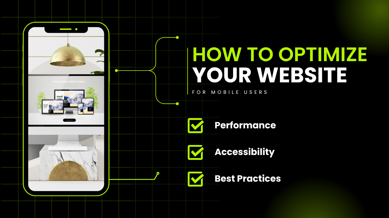
In 2025, more than 70% of global website traffic comes from mobile devices. If your website isn’t optimized for mobile, you’re not just delivering a poor user experience—you’re losing visitors, conversions, and even search rankings. With Google’s mobile-first indexing, mobile usability has moved from being an option to an absolute necessity.
In this guide, you’ll learn how to optimize your website for mobile users, boost your SEO, and ensure your visitors stay longer and convert more.
🚀 Why Mobile Optimization Is Critical in 2025
Today’s users expect fast, clean, and seamless browsing on their smartphones. Whether they’re searching for local services, shopping online, or reading a blog, they won’t wait for a slow or cluttered site to load.
Key reasons to prioritize mobile optimization:
- Mobile-first indexing by Google directly affects rankings
- 53% of mobile users abandon pages that take longer than 3 seconds to load
- Responsive and mobile-optimized websites reduce bounce rate and improve engagement
- Mobile-friendliness increases conversions, especially for ecommerce sites
 Unlock Your Savings Today!
Get the best deals with unbeatable service and exclusive offers.
 Grab 30% Off Now
 +91 7982069569
 WhatsApp
You May Also Like - More to Explore

2 Min Read Time
1.9k ViewsHyper-Personalization in Sonipat Marketing 2025
Explore how hyper-personalization helps Sonipat businesses deliver tailored messages and improve customer engagement through ... Explore More
 Ashwani Kumar
2025-07-22
Ashwani Kumar
2025-07-22

2 Min Read Time
1.9k ViewsThe Power of Push Notifications for Customer Retention
Discover how push notifications drive customer retention and boost client engagement. Learn best practices, tools, and metric... Explore More
 Pallavi Singh
2025-06-23
Pallavi Singh
2025-06-23
📱 What Does Mobile Optimization Mean?
Mobile optimization involves designing and formatting your website so that it functions perfectly on smartphones and tablets. This includes:
- Fast loading times
- Readable text without zooming
- Easy navigation with thumb-friendly buttons
- No horizontal scrolling
- Properly displayed images and videos
It’s about delivering a smooth user experience regardless of device size.
Optimizing your website for mobile users is no longer optional—it’s essential for delivering a seamless user experience and improving conversions. If you're a business in Sonipat looking for expert help with mobile optimization and performance, Quantam Minds – the Best Digital Marketing Agency in Sonipat offers tailored solutions to ensure your site looks great and functions flawlessly on every device.
🔧 Steps to Optimize Your Website for Mobile Users
✅ 1. Use Responsive Web Design
Responsive design makes sure your website adjusts smoothly to various screen sizes.Tools like WordPress themes, Bootstrap, and CSS media queries make your layout flexible across devices.
✅ 2. Speed Up Your Site
Mobile users are impatient. Optimize loading time by:
- Compressing images with tools like TinyPNG
- Using caching plugins
- Minifying CSS, JavaScript, and HTML
- Using a reliable hosting provider with a CDN
✅ 3. Simplify Navigation
Mobile navigation must be intuitive:
- Use a hamburger menu
- Keep navigation items limited
- Make buttons large enough to tap with a thumb
✅ 4. Optimize Fonts and Content
- Use legible fonts (16px or larger)
- Break content into short paragraphs
- Use bullet points and headings for easier scanning
- Avoid intrusive pop-ups or interstitials
✅ 5. Design for Touch
Ensure all interactive elements (buttons, links, forms) are tap-friendly. Use padding and spacing to prevent mis-clicks.
✅ 6. Mobile-Friendly Forms
- Use fewer fields
- Enable autofill
- Use dropdowns and toggles instead of text input where possible
 Grow Your Business with Proven Digital Marketing
Ready to attract more customers and outshine your competition? Our tailored digital marketing strategies help you rank higher, generate qualified leads, and build a brand people trust. Let’s take your business to the next level.
Digital Marketing Solutions in Leading Cities
✅ 7. Test Across Devices
Don’t guess—test your site on real devices and tools like:
- Google Mobile-Friendly Test
- BrowserStack
- Responsinator
📈 Mobile SEO Best Practices
To rank higher on search engines, implement these SEO strategies:
- Use mobile-first keywords (often long-tail or voice-based)
- Create mobile-specific content if necessary
- Add schema markup for rich snippets
- Ensure internal links are easy to click and relevant
- Use clean URLs and proper heading structure
💡 Focus on Local SEO
Mobile users often search for local services. Optimize your Google Business Profile, use location-specific keywords, and encourage reviews to capture mobile local traffic.
 Disclaimer
The views expressed by experts in this article are their own and do not necessarily reflect the opinions of any website, organization, institution, or affiliated entity. If you have any concerns regarding this article, please contact us at contact@quantamminds.com and also on WhatsApp
Frequently Asked Questions
How do I know if my website is mobile-friendly?
Use the free Google Mobile-Friendly Test tool. It provides insights into what’s working and what needs improvement.
Does mobile optimization affect SEO?
Yes! Google’s mobile-first indexing means your mobile site is the version used to rank your pages.
What’s the best image size for mobile websites?
Keep images under 100KB when possible, and always use compressed JPEG or WebP formats for faster loading.
Can I use identical content for both desktop and mobile versions of my site?
Yes, as long as it’s responsive and easy to consume on both devices. Break content into chunks for better mobile readability.
Should I create a separate mobile site?
It’s better to use responsive design rather than a separate site. It’s easier to maintain and better for SEO.
 Share This Article