


Listen to This Article
Xiaomi HyperOS 3 Brings Bold UI Refresh with New Signal and Battery Icons
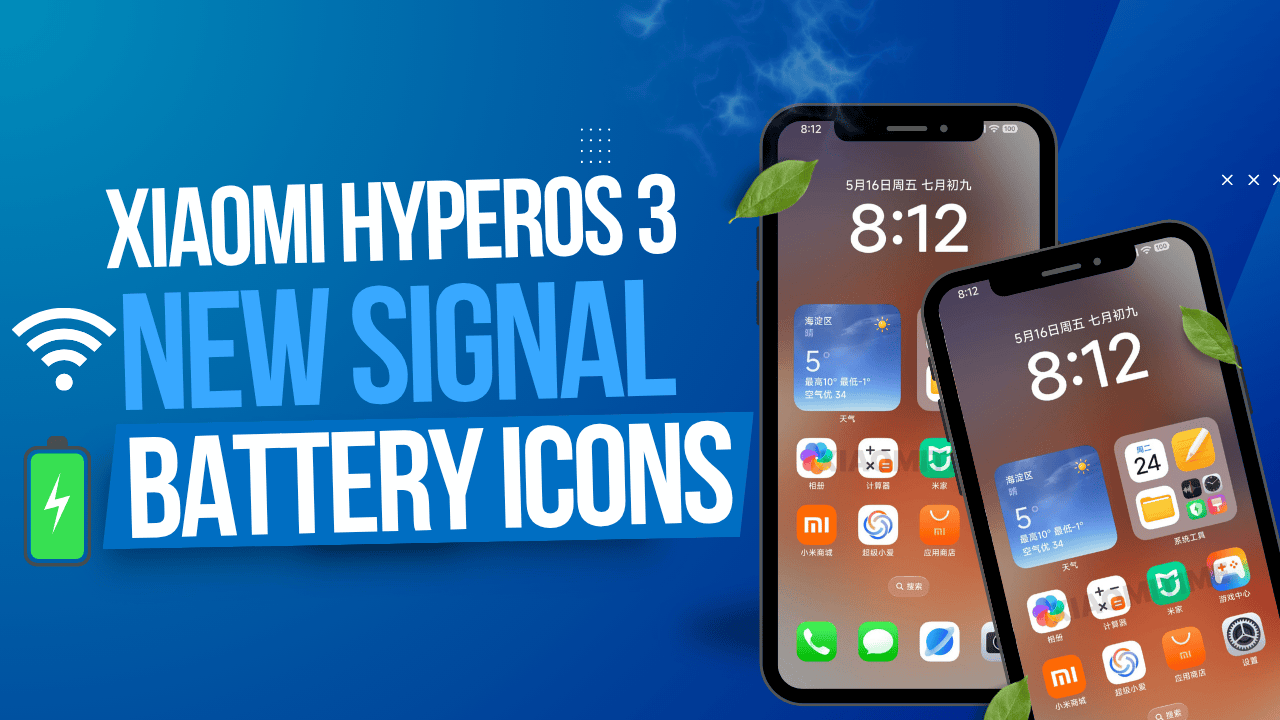
Xiaomi is taking a bold step forward with HyperOS 3, introducing not just a software update, but a carefully designed user experience revamp. One of the standout highlights? A long-awaited redesign of the signal and battery icons—bringing a fresh look that’s clearly inspired by Apple’s iOS, yet still distinctively Xiaomi.
Let’s dive into what’s new, what’s changing, and what it means for Xiaomi users.
✅ Aesthetic Meets Function: Redesigned Signal and Battery Indicators
The signal and Wi-Fi indicators, previously subtle and minimal since the days of MIUI 6, now appear in a thicker and bolder format. These enhancements make it easier to quickly read your signal strength, especially under bright lighting or on large displays. It’s more than just a stylistic shift—it’s a user experience upgrade.
On the battery side, the traditional semi-transparent look is gone. In its place: a solid, matte icon with a professional, modern feel. It’s cleaner, clearer, and more aligned with today’s flagship UI trends—particularly those championed by iOS.
🧠 System-Wide Interface Enhancements: More Than Icons
But the update doesn’t stop at signal and battery bars. Xiaomi has refined many aspects of the HyperOS 3 interface to mirror the polished, premium experience users now expect.
-
App Icons have received a visual refresh, now closely resembling iOS 18 designs.
-
Home Screen Improvements include the removal of the search bar, freeing up space for more widgets or app icons.
-
Battery Percentage Display has been refined to echo the minimalist approach seen on iPhones, ensuring clarity without clutter.
These updates suggest Xiaomi is prioritizing a UI that looks premium, feels clean, and operates smoothly across devices.
🧊 Glass UI Elements: A Touch of Sophistication
Building on modern design trends, HyperOS 3 incorporates glass-inspired UI elements throughout multiple system layers. These translucent panels bring a sense of depth, layering, and elegance—giving your phone a more luxurious and tactile digital experience.
 Unlock Your Savings Today!
Get the best deals with unbeatable service and exclusive offers.
You May Also Like - More to Explore

2 Min Read Time
1.9k ViewsIndia Cancels US F-35 Deal After Trump’s Tariff Blow
India has decided to withdraw from a potential deal to purchase US F-35 stealth fighter jets following former President Donal... Explore More
 Ashwani Kumar
2025-08-04
Ashwani Kumar
2025-08-04

3 Min Read Time
1.9k ViewsNo Passports: China Bans Public Employee Travel
China has introduced strict new travel restrictions, preventing public employees—including teachers, government staff, and ... Explore More
Ashwani Kumar
2025-08-04

📱 Expansive Device Compatibility: It’s Not Just for Flagships
Xiaomi is ensuring that HyperOS 3 won’t be limited to high-end phones. The company has committed to rolling out the update across:
-
33 Xiaomi devices
-
44 Redmi devices
-
19 POCO devices
This wide compatibility ensures the visual and functional improvements of HyperOS 3 are felt throughout the entire Xiaomi ecosystem—from budget to premium smartphones.
🗓️ Launch Timeline & Compatibility
The official launch for HyperOS 3 is scheduled for October 2025. Impressively, Xiaomi has designed the update to support both Android 15 and Android 16, depending on the device’s hardware and launch cycle.
To get early access to system feature previews, Xiaomi suggests using the MemeOS Enhancer app, available directly from the Play Store. It offers advanced tweaks and faster delivery of new features and app updates.
📝 In Summary
Xiaomi’s HyperOS 3 isn’t just another version—it’s a statement. With smarter design, enhanced visual consistency, and broader support across devices, Xiaomi is pushing to align itself more closely with global premium standards. Whether it’s through the bold new icons, glass UI aesthetics, or system-wide refinements, this update shows Xiaomi is serious about user experience in 2025 and beyond.
If you’re a Xiaomi, Redmi, or POCO user, HyperOS 3 is more than just an update—it’s a transformation. Expect your device to feel more premium, more fluid, and more visually appealing, all while staying true to Xiaomi’s performance-first DNA.
 Grow Your Business with Proven Digital Marketing
Ready to attract more customers and outshine your competition? Our tailored digital marketing strategies help you rank higher, generate qualified leads, and build a brand people trust. Let’s take your business to the next level.
Digital Marketing Solutions in Leading Cities
Xiaomi introduced bold UI changes in HyperOS 3, including new signal and battery icons, for several strategic reasons aimed at improving user experience, brand positioning, and competitive advantage. Here's why Xiaomi did this:
🔍 1. To Align with Global Design Trends
Xiaomi is clearly taking inspiration from Apple's iOS design language, which is known for its polished, clean, and user-friendly interface. The thicker signal bars and solid matte battery icons mirror the iOS aesthetic, making HyperOS feel more premium and familiar to users who appreciate minimal and intuitive UI.
🎯 2. To Improve Visual Clarity & Accessibility
Older icons (like those from MIUI 6 or MIUI 12) were thin and less visible in bright light or at quick glances. The thicker, bolder signal and Wi-Fi bars in HyperOS 3 are not just for show—they provide better readability, which enhances usability in real-world conditions, especially outdoors.
📱 3. To Modernize the Look and Feel of HyperOS
HyperOS is Xiaomi’s next-gen operating system replacing MIUI. With HyperOS 3, Xiaomi wants to:
-
Modernize the system UI
-
Introduce glass UI elements for depth
-
Use iOS-inspired icons and transitions
These changes help HyperOS shed the “budget” feel often associated with MIUI and position it as a premium experience.
🔄 4. To Maintain Consistency Across Devices
With Xiaomi, Redmi, and POCO brands all running on HyperOS, updating the UI elements like signal and battery indicators ensures a unified brand experience across its massive product lineup (over 90 devices).
⚔️ 5. To Compete More Directly with Flagship Brands
By mimicking UI elements from top-tier systems like iOS and One UI, Xiaomi is strategically aiming to attract premium customers who want a polished experience but at a more affordable price. These visual updates help bridge that psychological gap.
🛠️ 6. To Showcase HyperOS as Future-Ready
HyperOS is designed to support Android 15 and Android 16, and Xiaomi wants the software to feel as cutting-edge as its hardware. Visual updates like these show users that Xiaomi is not just adding features—they are reimagining the experience.
✅ In Summary
Xiaomi redesigned the signal and battery icons in HyperOS 3 to:
-
Improve usability and readability
-
Align with modern design standards
-
Compete visually with iOS and Samsung
-
Upgrade its ecosystem-wide user experience
It's a mix of aesthetic, functional, and strategic motives—all intended to make Xiaomi’s software feel as flagship-ready as its hardware.
Here's a side-by-side comparison of Xiaomi's HyperOS 3 UI refresh vs Apple's iOS 18, especially focusing on the signal and battery icons, along with other design changes:
🔄 Signal & Battery Icon Comparison
| Feature | HyperOS 3 | iOS 18 (Apple) |
|---|---|---|
| Signal Icon | Thicker, bold vertical bars (new in HyperOS 3); easier to read in bright light | Rounded, pill-shaped bars stacked vertically, subtle shading for depth |
| Wi-Fi Indicator | Bolder arcs, flatter design with high contrast | Smooth arcs with light gradients, classic iOS style |
| Battery Icon | Solid matte icon (replaces semi-transparent design from MIUI 12) | Flat, clean battery icon with white fill and percentage inside |
| Battery Percentage | Displayed beside or inside the battery icon (customizable) | Displayed inside battery icon; matches iPhone status bar style |
| Design Feel | Inspired by iOS but sharper and more contrast-heavy | Balanced, minimal, and softly lit (Apple’s signature) |
🧩 Additional UI Elements
| Feature | HyperOS 3 | iOS 18 |
|---|---|---|
| App Icons | Rounded square icons with updated shadows & blur effects | Same rounded square icons with subtle enhancements |
| System Animations | Faster transitions, iOS-like fluidity | Smoother, polished with natural easing |
| Home Screen Changes | Search bar removed, more space for widgets & apps | Consistent layout with focus on Spotlight & widgets |
| Glass UI Elements | Newly introduced, light blurs behind system menus | Deeply integrated since iOS 7 (refined in 18) |
| Lock Screen Clock | Now customizable; elongated fonts like iOS 16/17/18 | Highly customizable since iOS 16 |
🎯 Overall Design Strategy
| Parameter | Xiaomi HyperOS 3 | Apple iOS 18 |
|---|---|---|
| Target Look | Premium, clean, Apple-inspired | Timeless elegance, subtle innovation |
| Usability Focus | High contrast for clarity in bright light | Seamless UI for consistency |
| Brand Identity | Merging iOS style with Xiaomi features | Strong and unique Apple visual identity |
| Market Intent | Appeal to mid- and high-end users wanting iOS-like UI on Android | Retain loyal user base with iterative design excellence |
📝 Summary
Xiaomi’s HyperOS 3 visually mimics iOS 18 in many core areas—especially status icons, home screen layout, and system animation smoothness. While Apple maintains a refined and mature UI, Xiaomi’s new direction shows a strong intention to blend aesthetic with functionality in a way that appeals to users switching from or drawn to the Apple ecosystem.

 Disclaimer
The views expressed by experts in this article are their own and do not necessarily reflect the opinions of any website, organization, institution, or affiliated entity. If you have any concerns regarding this article, please contact us at contact@quantamminds.com and also on WhatsApp
Frequently Asked Questions
What is new in Xiaomi HyperOS 3?
HyperOS 3 brings a refreshed interface including new signal and battery icons, a matte finish UI, glass effects, updated app icons, and a streamlined home screen experience inspired by iOS 18.
Are the new signal and battery icons functional changes or just visual?
While primarily visual, the redesign improves readability and clarity, especially in bright environments—enhancing the overall user experience.
Which devices will get the HyperOS 3 update?
The update will roll out to 33 Xiaomi, 44 Redmi, and 19 POCO devices, making it one of the widest rollouts in Xiaomi's history.
When will HyperOS 3 officially launch?
The official announcement and rollout are scheduled for October 2025, with support for both Android 15 and Android 16 based on device compatibility.
What is the MemeOS Enhancer app and is it necessary?
The MemeOS Enhancer app helps users access advanced tweaks, feature previews, and direct system app updates. It’s optional but useful for those wanting early feature access.


