Why Visitors Leave Even When Your Website Looks Professional: The Hidden Trust and Decision-Making Mistakes
A website can look expensive and still lose customers.
The colours are polished. The images are sharp. The animation works smoothly. The homepage looks like it came from a well-known brand.
And yet, people visit, scroll for a few seconds, then leave.
This is one of the more frustrating website mistakes because everything appears fine from the business owner's side. The problem is usually somewhere deeper. Visitors are not judging the website only by its appearance. They are quietly asking themselves whether this business understands their problem, whether the information feels genuine, and whether contacting the company will be worth their time.
A professional-looking website creates the first impression. It doesn't automatically create trust.
The Website Looks Good, But Says Very Little
One of the most common website design mistakes is giving visual design more attention than useful information.
A homepage may say:
"Transforming Businesses Through Innovation."
It sounds professional.
But what does the company actually do? Who is it for? What problem does it solve? Why should someone choose it instead of another provider?
If visitors have to search through three or four pages to understand the basic offering, some will simply leave.
This becomes particularly important for service businesses. A potential customer often arrives with a specific problem and limited patience. They don't want to decode clever marketing language.
They want clarity.
A stronger website usually makes the important information easy to find:
- What the business offers.
- Who the service is intended for.
- What makes the approach different.
- What the customer should do next.
- How to get in touch.
- What evidence supports the business's claims.
The design can still be premium. It just shouldn't hide the information people came for.
Trust Is Lost in Small Details
Visitors rarely announce, "I don't trust this website."
They simply don't enquire.
Sometimes the reason is surprisingly small.
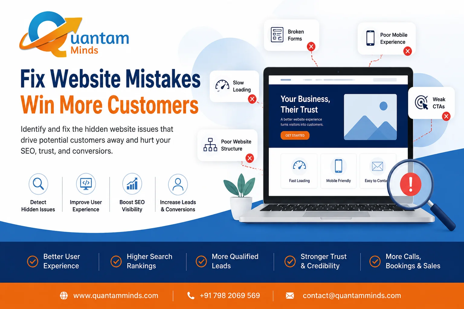
An outdated phone number. A contact form that looks broken. Stock photographs that don't match the business. Missing company information. No recent work examples. A service page with vague claims and no evidence.
Individually, these details may seem minor.
Together, they create hesitation.
This is especially important when the customer is considering an expensive service. A manufacturer looking for a technology partner, for example, may spend several minutes checking the company behind the website before making contact. A polished homepage won't compensate for missing information elsewhere.
Poor User Experience Creates Decision Fatigue
A poor website user experience doesn't always mean a website is technically broken.
Sometimes it simply makes visitors work too hard.
They click a menu.
Then another page.
Then another.
The information they need is still unclear.
This is where many common website mistakes become expensive. Businesses keep adding content without considering how visitors actually move through the website.
A better structure gives users a clear path.
For example:
Service page → Relevant proof → Key benefit → Supporting information → Contact option
The path doesn't need to be identical for every visitor. It just needs to make sense.
Mobile Visitors Notice Problems Faster
A website may look excellent on a desktop screen and still create problems on a phone.
Text becomes difficult to read. Buttons are too close together. Images push important information below the fold. Forms become annoying to complete.
These are signs of poor mobile website design, and they can quietly affect customer decisions.
For many businesses, mobile visitors are an important part of the audience. If the mobile experience feels like an afterthought, trust can disappear quickly.
It doesn't matter how impressive the desktop version looks.
Slow Websites Create Doubt Before Trust Has a Chance
Slow website loading speed is another problem that is often treated as purely technical.
It isn't.
Imagine searching for a service, clicking a promising result, and then waiting several seconds for the page to become usable.
You may leave.
Even if you stay, the delay has already changed your perception of the business.
A slow website can make an organisation appear less organised or less attentive to detail, even when that impression isn't fair.
Performance depends on many things, including hosting, images, scripts, code, integrations, and the overall website architecture. Fixing it isn't always as simple as compressing a few images.
The Call to Action Comes Too Late
Another common website conversion mistake is asking for the enquiry only after giving visitors too much information.
A customer who is ready to contact you shouldn't have to reach the bottom of a 2,000-word page to find a phone number.
At the same time, placing "Contact Us" everywhere isn't the answer either.
The call to action should appear when the visitor has enough information to make the next decision.
For a service business, that might be:
- Request a consultation.
- Ask for a quotation.
- Book an appointment.
- Speak with an expert.
- Request more information.
The wording should match the customer's level of readiness.
Your Website Needs to Reduce Uncertainty
People often leave because they still have unanswered questions.
"Will this company understand my requirements?"
"Have they worked with businesses like mine?"
"What happens after I submit the form?"
"How much involvement will I need?"
"Can I trust them with this project?"
A strong website doesn't need to answer every possible question. It should answer the questions that commonly stop customers from moving forward.
That's where case studies, project examples, clear service descriptions, transparent processes, reviews, FAQs, and genuine business information become useful.
Not decoration.
Evidence.
Sometimes the Problem Is the Website Structure
If the website keeps becoming harder to manage as the business grows, the issue may be deeper than a few design changes.
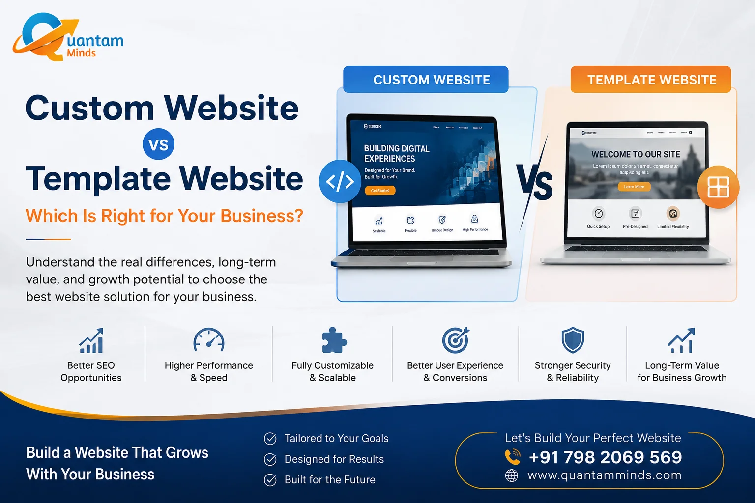
A professionally planned website development service can address the underlying structure, performance, navigation, functionality, and scalability of the website. Depending on the business, this may involve web development, web design and development, or a more customised approach through a web development agency.
A template isn't automatically bad.
Custom development isn't automatically better.
The important question is whether the website architecture supports the way the business actually operates.
A Professional Website Should Help Customers Decide
The real test of a website isn't whether the owner likes the design.
It's whether a potential customer can arrive with a question, find a credible answer, understand the offer, and confidently decide what to do next.
That's where good design, content, performance, SEO, and development meet.
A website can look impressive and still fail at that job.
And sometimes the fix isn't another redesign. It may be clearer messaging, better navigation, stronger evidence, faster pages, or a simpler enquiry process.
The limitation is that there is no single checklist that can identify every problem. Customer behaviour varies by industry, audience, and buying intent.
The useful approach is to look at the website through the customer's eyes, not the owner's screen.
Website Conversion Mistakes That Make Interested Customers Hesitate Before Calling, Booking, or Buying
Getting visitors to your website is only part of the job.
The harder part comes after they arrive.
A potential customer may already be interested in your service. They have searched for it, clicked through to your website, read the page and perhaps even looked at your pricing. Yet something makes them pause.
They don't call.
They don't book.
They don't submit the form.
They simply leave and continue comparing other businesses.
These are some of the most expensive website conversion mistakes because the visitor has already done the difficult part. They found you and showed interest. The website simply failed to make the next decision easy enough.
Your Call to Action Is Too Generic
"Submit."
"Learn More."
"Contact Us."
These buttons aren't necessarily wrong, but they often provide very little context.
A customer should have some idea what happens after clicking.
A service business could use:
- Request a consultation
- Get a project estimate
- Speak with our team
- Book an appointment
- Request a quotation
The right wording depends on the customer's intent.
Someone comparing expensive business software may not be ready to "Buy Now." A customer looking for an urgent repair may not want to "Learn More."
Small wording choices can remove unnecessary hesitation.
The Website Asks for Too Much Information
Long forms are another common problem.
A business may want the visitor's:
- Name
- Phone number
- Company name
- Location
- Budget
- Industry
- Requirements
- Project timeline
All of that information might be useful internally.
But asking for everything at the first interaction creates friction.
A visitor may think, "I'll do this later."
Later often doesn't happen.
Start with the information genuinely required for the next step. Additional details can be collected during a conversation or later stage of the enquiry process.
Pricing Is Either Completely Missing or Poorly Explained
Pricing can be uncomfortable for businesses.
Some don't want competitors seeing their rates. Others worry that displaying a price will discourage potential customers.
But hiding every indication of cost can create a different problem.
Visitors may assume the service is outside their budget and leave without asking.
You don't necessarily need to publish fixed prices. Depending on your business model, you can explain pricing factors, starting ranges, package structures, or what influences the final quotation.
For website development services, for example, the cost can vary considerably based on functionality, integrations, design requirements, content, ecommerce features, and ongoing support.
Giving visitors some context is often more useful than simply saying, "Contact us for pricing."
The Page Doesn't Answer the Customer's Real Concern
A service page can contain 1,500 words and still fail to convert.
Length isn't the problem.
Relevance is.
Imagine someone searching for an ecommerce website developer. They're likely thinking about more than website design. They may be concerned about payment gateways, product management, shipping, security, mobile experience, integrations, and future expansion.
If the page only talks about attractive designs and modern technology, the visitor still has unanswered questions.
This is where common website mistakes often become conversion problems.
The content needs to address the decision the customer is actually trying to make.
There Is No Evidence Behind the Claims
"We deliver exceptional quality."
"We create powerful digital experiences."
"We help businesses grow."
These statements sound professional.
They also appear on thousands of websites.
Customers are more likely to trust specific evidence.
That might include:
- Relevant case studies.
- Real project screenshots.
- Client reviews.
- Before-and-after examples.
- Industry experience.
- Development process.
- Clear business information.
A company doesn't need hundreds of testimonials to establish credibility. A few relevant and genuine examples can be more useful than a large collection of vague praise.
The Website Makes Visitors Search for Contact Information
This sounds obvious, yet it happens frequently.
A visitor wants to call.
The phone number isn't visible.
They search the footer.
Then the contact page.
Then perhaps an image containing the number.
That's unnecessary friction.
Important contact options should be easy to find, especially when the customer's intent is already strong.
For local businesses, this becomes even more important. Phone, WhatsApp, enquiry forms, location information, and opening hours should be presented where they naturally support the customer's decision.
Mobile Forms Create a Different Kind of Friction
A form that works perfectly on desktop may become frustrating on a phone.
Fields are too small.
The keyboard covers the button.
Dropdowns are difficult to use.
The page jumps while typing.
The visitor makes a mistake and has to start again.
These problems are part of poor mobile website design, and they can directly affect conversions.
Testing a website on a desktop browser isn't enough. Real users interact with websites differently on phones, particularly when they are moving between search results, messaging apps, and websites.
Slow Pages Interrupt Buying Intent
Someone who is ready to buy doesn't necessarily have more patience than someone who is casually browsing.
Sometimes they have less.
A slow website loading speed can interrupt the decision at exactly the wrong moment.
This is especially problematic for landing pages used in paid advertising. You're paying to bring visitors to the page, so losing them because the page takes too long to become usable can make the entire campaign less efficient.
Performance depends on hosting, code, images, scripts, integrations, and page structure. It needs to be looked at as part of the overall website rather than treated as a minor technical issue.
Too Many Choices Can Create Hesitation
Businesses often try to put everything on one page.
Every service.
Every offer.
Every social profile.
Every possible contact method.
Every product.
The intention is helpful.
The result can be overwhelming.
A conversion-focused page should give visitors a clear next step without forcing them to make ten smaller decisions first.
This doesn't mean removing useful information. It means organising it around the customer's journey.
Your Website May Be Asking for Trust Too Early
A customer who has just discovered your business may not be ready to submit a detailed enquiry.
They may need to understand your service first.
This is particularly common with high-value services.
A manufacturer looking for a software development partner may spend time reviewing capabilities before contacting anyone. A clinic patient may want to understand the doctor's expertise and appointment process first.
Trying to force a conversion before trust has developed can have the opposite effect.
Sometimes the right conversion isn't a phone call.
It might be reading another page, viewing a case study, checking a service detail, or returning later.
Fixing Conversion Problems Often Requires More Than a Redesign
If a website isn't converting, replacing the colours and changing the homepage layout may not solve the real problem.
The issue could be:
- Weak messaging.
- Poor page structure.
- Slow performance.
- Unclear CTAs.
- Difficult forms.
- Missing trust signals.
- Weak mobile experience.
- Mismatch between search intent and landing page content.
A professional website development company can address technical and structural issues, while web development services may be required when existing functionality limits what the website can do.
For businesses with more complex requirements, web development agency support or a custom web app development approach may be appropriate.
But development should follow diagnosis.
Otherwise, businesses end up paying for a new website without fixing the decision-making problem that caused the original conversion issues.
Make the Next Decision Easier
A website doesn't need to persuade everyone.
It needs to help the right visitor make a confident next decision.
Sometimes that's calling.
Sometimes booking.
Sometimes purchasing.
And sometimes simply continuing to research.
The most effective website conversion improvements usually come from removing uncertainty and unnecessary effort rather than adding more design elements.
Look at your website as a customer would.
Can they understand what you offer?
Can they see why they should trust you?
Can they find the information they need?
Can they easily take the next step?
If any answer is no, that's probably where the real conversion problem begins.